

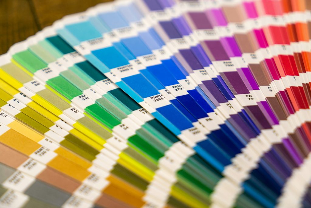
Color psychology is the study of how colors affect perception, emotion and behavior. In marketing, research shows color shapes how people judge a brand, but the effect depends on context, culture and product category.
Below, we separate what peer-reviewed studies support from what blogs repeat without evidence. You will see the key studies, the most common myths with their real sources, a table of color associations in branding, and a practical process for choosing brand colors that also pass accessibility checks.
What is color psychology?
Color psychology is a branch of psychology that studies how perceiving a color changes feelings, judgments and actions. Researchers test it with controlled experiments, for example showing the same logo in different hues and measuring how people rate the brand.
Two ideas sit underneath almost every serious finding. First, some reactions to color appear to be broadly shared across cultures, probably because of a mix of biology and common experience. Second, many reactions are learned: people associate colors with objects, events and categories they have seen many times.
Andrew Elliot and Markus Maier formalized this in their color-in-context theory. In a 2015 review in Frontiers in Psychology, Elliot describes how the same color carries opposite meanings in different settings: blue on a first-place ribbon reads as positive, blue on a piece of meat reads as spoiled. The same review calls the field nascent and points to small samples as a recurring weakness.
What does research show about color psychology in marketing?
Research on color psychology in marketing supports one solid conclusion: color changes how people perceive a brand’s personality, and through that, how much they like it and intend to buy. The size of the effect varies, and no color works the same way for every product.
The most cited study is Lauren Labrecque and George Milne, “Exciting red and competent blue: the importance of color in marketing”, published in 2012 in the Journal of the Academy of Marketing Science (vol. 40, no. 5). Across four studies they mapped hues to brand personality dimensions, showed that saturation and lightness amplify those traits, and demonstrated that changing a logo’s color can shift both perceived personality and purchase intent. Red was linked to excitement and blue to competence, as the title says.
Cross-cultural data adds an important layer. A 2020 study in Psychological Science led by Domicele Jonauskaite asked 4,598 people from 30 nations, speaking 22 languages, to link 20 emotions with 12 color terms. Associations were largely shared worldwide, yet each nation still had its own pattern, and countries that were closer in language or geography answered more alike.
Preference data points the same way. A 2015 YouGov survey in 10 countries on four continents found blue was the most popular color everywhere, chosen by 23% to 33% of respondents. Popularity is not persuasion, though: a color people like in general may still feel wrong on a specific product.
Color psychology myths you should stop repeating
The most repeated color psychology claims come from misquoted reviews, single small studies or results that later failed to replicate. The table below shows where each claim comes from and what the evidence supports today.
| Popular claim | Where it comes from | What the evidence says |
|---|---|---|
| “Up to 90% of snap judgments about products are based on color” | Satyendra Singh, “Impact of color on marketing”, Management Decision, 2006 | The paper is a literature review, not an experiment. Its abstract gives a wide 62-90% range; blogs turned it into one precise number about purchases |
| “Red makes people hungry, so fast food uses it” | Marketing folklore | No solid evidence that red itself raises appetite. Red and yellow are a category convention and stand out on the street |
| “Pink walls calm aggressive people” | 1970s and 1980s reports on “Baker-Miller pink” | A controlled 2015 study with 59 Swiss inmates (Genschow and colleagues) found no difference between pink and standard cells |
| “Red makes you more attractive” | Early romantic-red experiments | High-powered replications by Lehmann and Calin-Jageman (2017) found little or no effect |
| “Seeing red lowers test scores” | Early achievement-context studies | A 2020 meta-analysis by Timo Gnambs found limited evidence; close replications showed near-zero effects |
| “A red button always beats a green one” | Single A/B tests shared online | What matters is contrast with the rest of the page, not the hue. Test on your own site |
Singh’s paper is still worth reading for its overview, and its core point that color matters is fair. The problem is the precision: a range quoted from earlier sources, about first impressions of people or products, became “90% of purchase decisions” in hundreds of articles.
Why context matters more than color meaning charts
Context matters more than a color’s generic meaning because people read color through the product, the category and the culture around it. A charcoal black feels premium on a watch box and heavy on a children’s toy.
Category conventions are learned associations. Banks, insurers and software companies use blue so often that blue now signals “this is a finance or tech brand”, which helps recognition and makes differentiation harder. Many organic food brands use green for the same reason.
Culture changes the reading too. White is linked with weddings in much of the West but with mourning in parts of East Asia. The Jonauskaite study confirms the pattern: the broad emotional associations travel well, the specifics do not.
Contrast often does more work than the hue itself. The isolation effect, described by Hedwig von Restorff in 1933, shows that an item which differs from its surroundings is more likely to be noticed and remembered. A call-to-action button works because it stands apart from the page, so an orange button on a blue site and a blue button on an orange site can both perform well.
Colors in branding: common associations and their limits
Colors in branding carry associations that most audiences recognize, but they are tendencies, not rules. Use the table below as a starting point for discussion, and check each choice against your category and market. Our upcoming guide to color meanings covers each hue in more depth.
| Color | Common associations | Typical categories | Watch out for |
|---|---|---|---|
| Red | Energy, urgency, excitement | Food, retail, entertainment | Can signal errors or danger in interfaces |
| Orange | Friendliness, low price, action | Retail, delivery, CTAs | Can look cheap in luxury contexts |
| Yellow | Optimism, attention | Food, kids, transport | Poor contrast as text on white |
| Green | Nature, health, money | Food, finance, wellness | Overused in eco claims |
| Blue | Competence, calm, reliability | Finance, tech, healthcare | Hard to stand out in crowded categories |
| Purple | Creativity, luxury | Beauty, entertainment | Meaning varies widely by culture |
| Black | Sophistication, power | Fashion, luxury, tech | Can feel heavy or cold |
| White | Simplicity, cleanliness | Health, tech | Mourning color in parts of East Asia |
Saturation and lightness change the message as much as hue. Labrecque and Milne found that these two properties amplify brand personality traits, so a bright, saturated red reads differently from a dark, muted one. Note the exact values in your guidelines as HEX codes; our guide on HEX color codes explains how they work.
Look at brands in your space before deciding. Many leading banks and social networks rely on blue, as our upcoming article on famous blue logos shows, which makes a second color or a different shade more important for recognition.
How to choose brand colors using color psychology
Choose brand colors by starting from the personality you want people to perceive, then testing candidates against your category, market and accessibility rules. The steps below turn color psychology research into decisions.
- Write down three to five personality traits for the brand, for example “competent, calm, modern”.
- Map those traits to candidate hues, then adjust saturation and lightness to match the tone.
- List the colors your main category already uses and decide whether to fit in or stand apart.
- Check cultural readings in every market where you sell, especially for white, purple, yellow and black.
- Build a palette: one primary color, one or two secondary colors and neutral tones for text and backgrounds.
- Test contrast for text and buttons, then run a simple preference or A/B test with real users.
- Record final HEX values and usage rules so every designer applies them the same way.
A quick way to try combinations is the free Brand Generator, which drafts names, palettes and visual directions you can then refine. Once the palette is final, it becomes part of your brand identity and should be written into brand guidelines.
Color and accessibility: a palette has to work for everyone
An effective brand palette must stay readable for people with low vision and color vision deficiency, because a color nobody can read persuades nobody. Accessibility rules are clearer and better tested than most color psychology claims.
The Web Content Accessibility Guidelines published by the W3C require a contrast ratio of at least 4.5:1 for normal text and 3:1 for large text at level AA. Light yellow, mint and pastel blue on white usually fail, which is why many brands keep a darker variant for text.
Color vision deficiency affects roughly 1 in 12 men and 1 in 200 women of Northern European descent, most often as red-green confusion. WCAG also says color must not be the only way to convey information, so pair red and green status colors with icons or labels. Our article on usability principles covers the wider design rules.
FAQ
Is color psychology real or a myth?
Color psychology is real, but much of what is written about it is exaggerated. Peer-reviewed studies show that color affects brand perception and purchase intent, yet the effects depend on context, culture and product. Claims such as “90% of purchases depend on color” or “pink calms aggression” are not supported by current evidence.
What is the most effective color in marketing?
No single color is the most effective in marketing. The best color is the one that fits the personality you want to project, differs from close competitors and has enough contrast to be seen. Blue is the most liked color in many surveys, but that does not make it the best choice for every brand.
What does the color blue mean in branding?
Blue in branding is most often associated with competence, reliability and calm. Labrecque and Milne (2012) found blue linked to perceived competence, which helps explain its popularity with banks and tech companies. Because so many brands use it, blue alone rarely makes a brand distinctive.
Does red increase sales or appetite?
There is no solid evidence that red itself increases sales or appetite. Red attracts attention and is linked to excitement, so it works well for promotions and calls to action when it contrasts with the page. Fast-food chains use red and yellow largely out of category convention and visibility.
Are color meanings the same in every country?
Color meanings are partly shared and partly local. A 2020 study of 4,598 people in 30 nations found broadly similar color-emotion associations, but each country also showed its own pattern. White, for example, signals weddings in much of the West and mourning in parts of East Asia.
How many colors should a brand palette have?
A practical brand palette has one primary color, one or two secondary colors and a set of neutral tones. Fewer colors make a brand easier to recognize and keep consistent across a website, social media and print. Define each color with exact HEX values and usage rules.
