

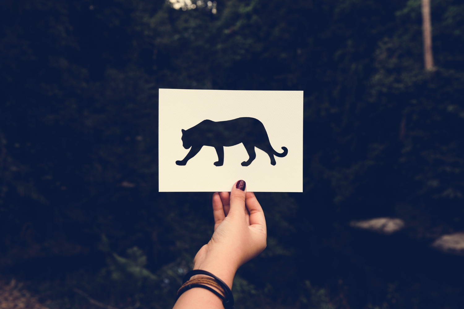
There are logos that people recognize, and then there are logos that people feel. The Puma leaping cat sits firmly in the second category. Whether it appears on a running shoe, a football kit, or a streetwear hoodie, that silhouette carries an immediate sense of speed and intention — an impression built over more than seven decades of careful evolution.
In this article, we trace the full history of the Puma logo from its earliest days in postwar Germany to the globally dominant symbol it is today, and we unpack the specific design choices that have made it one of the most enduring marks in sports branding.
Where Puma Began: The Brand Behind the Logo
Puma was founded in 1948 by Rudolf Dassler in Herzogenaurach, Germany — the same small town where his brother Adolf founded Adidas the same year, following the famous falling-out between the two brothers. Rudolf initially considered naming his company RUDA, a contraction of his own name, but ultimately chose Puma because the animal embodied every quality he wanted his products to project: speed, strength, suppleness, endurance, and agility.
The name was not just a marketing decision. It was a design brief. Every visual element that followed — the leaping silhouette, the black colorway, the clean sans-serif wordmark — was built around making those five qualities visible on a shoe, a shirt, or a storefront.
The Evolution of the Puma Logo: A Decade-by-Decade Timeline
1948: The Letter D Logo
The original Puma logo was not the leaping cat. It was the leaping cat inside a large letter D — the initial of Rudolf Dassler’s surname. The monochrome design showed the puma jumping through the letter, and it appeared in both a standard rectangular version and a hexagonal framing. By modern standards, it reads as busy and overly literal, but for a brand-new company in 1948 trying to establish a visual identity quickly, it was functional and distinctive.
1959–1968: The Form Strip Era
During the late 1950s and through the 1960s, Puma introduced the Form Strip — a distinctive curved stripe running along the side of its footwear. This strip was originally a functional element, designed to cradle the foot securely without restricting movement, but it became so closely associated with Puma that many consumers began treating it as the brand’s actual logo. The Form Strip gained particular visibility during the 1958 FIFA World Cup and remained a defining visual element for decades.
1968: The No. 1 Logo Is Born
The year 1968 marked the most significant moment in Puma’s visual history. The company introduced what it officially called the “No. 1 Logo” — a design showing the leaping puma positioned above the brand wordmark. The cat was rendered as a clean black silhouette, stripped of unnecessary detail, with a posture that communicated explosive forward movement.
This design became the foundation of everything that followed. The leaping puma silhouette that appeared on this logo in 1968 is, in its essentials, the same one Puma uses today. Over 55 years later, only minor refinements have been made — the eye and muzzle were eventually removed, and the ears were made more prominent — but the core form has remained untouched.
1974: Cat Beside the Wordmark
In 1974, Puma adjusted the spatial relationship between the cat and the text, positioning the leaping puma beside the wordmark rather than above it. This horizontal arrangement made the logo more practical for certain applications, particularly on apparel labels and product packaging, where vertical space is often limited.
1980–1982: The Cat Stands Alone
For a brief period in the early 1980s, Puma experimented with removing the wordmark entirely, relying solely on the leaping cat silhouette to carry the brand. This was a bold move that implicitly claimed the company had achieved the kind of recognition that only a handful of brands in the world reach — the level where a single graphic element is enough.
The experiment was eventually walked back, with the wordmark returning for the 1982–1988 period, but the standalone cat version has never been fully retired and continues to appear on certain product lines and brand applications today.
1988–Present: The Modern Logo
The current logo, which has been in continuous use since 1988, returns to the pairing of the leaping cat and the wordmark but strips away the white Form Strip that had been incorporated into earlier versions. The result is cleaner and more versatile — a mark that scales from a small embossed detail on a shoe tongue to a massive installation on a stadium wall without losing any of its clarity.
Five Things Worth Knowing About the Puma Logo
1. The Original Logo Was a Tribute to the Founder
The “D” in the 1948 logo stood for Dassler, Rudolf’s family name. It was a founder’s mark — the kind of design decision that makes complete sense in the first year of a company’s life and almost never survives contact with the brand’s long-term future. Puma moved on from it within two decades, but it remains an important part of the brand’s origin story.
2. The Form Strip Was Confused for the Logo
The curved stripe that ran along Puma’s shoes was so distinctive and so consistently applied that a significant portion of the consuming public believed it was the brand’s official logo. It was not — it was a design feature of the footwear — but its visual power was undeniable. Puma still incorporates the Form Strip into many of its products today.
3. Black Is the Official Brand Color
Despite appearing in red, white, navy, and countless other colorways over the years, Puma’s official logo color is black. The reasoning is practical as much as aesthetic: a black silhouette creates an effective transparent overlay on any background, making the logo usable across an almost unlimited range of product colors and materials. Black also communicates the qualities the brand wants to project — power, authority, and competitive seriousness.
4. The Logo Has Won Without Major Redesigns
Most major brands redesign their logos every decade or so. Puma has not needed to. The core visual concept established in 1968 has proven durable enough to remain relevant through multiple generations of consumers and multiple revolutions in fashion and sports culture. The minor refinements made over the years have been exactly that — minor — preserving rather than replacing the original idea.
5. The Typography Completes the Brand Message
The Puma wordmark uses capital letters in a sans-serif typeface with slightly rounded edges. The exact typeface has never been officially disclosed, but design analysts have identified it as resembling Quandor Regular or FF Softsoul Std Bold. The rounded edges soften what could otherwise be an overly aggressive all-caps treatment, making the brand feel approachable as well as powerful — a balance that matters for a company selling to everyday athletes as much as elite competitors.
What the Leaping Cat Actually Communicates
Logo analysis can become abstract quickly, so it is worth grounding it in the specific visual information that the Puma cat conveys. The animal is shown at the peak of a leap — all four legs extended, body fully horizontal, in the moment of maximum airborne velocity. This is not a resting puma, or a walking puma, or even a running puma. It is a puma at the exact instant of maximum physical performance.
That choice encodes the brand’s competitive positioning directly into the mark. Puma is not a brand for people who are getting ready to exercise. It is a brand for people who are performing. The logo makes that claim in a single image, without words, in less than a second of visual processing time.
Why the Puma Logo Has Lasted
The best sports logos share a common quality: they are built around an idea, not a trend. The leaping puma is an idea — the physical embodiment of the speed and power that every serious athlete is chasing. That idea does not get old. It does not go out of fashion. It does not need to be refreshed with a new typeface or a gradient to stay relevant.
Puma has, of course, adapted its visual identity over the decades to work across new media and new markets. But the core concept has never needed to change, because Rudolf Dassler got it right in 1968: find the animal that says everything you want your brand to say, and draw it at the moment it says it loudest.
Key Takeaways
- Puma was founded in 1948 by Rudolf Dassler; the brand name was chosen to reflect the five qualities of the animal: speed, strength, suppleness, endurance, and agility.
- The original 1948 logo featured the leaping cat jumping through the letter D, a tribute to the Dassler family name.
- The definitive “No. 1 Logo” was introduced in 1968 and remains the basis of the current design.
- Black is Puma’s official logo color, chosen for its versatility and its associations with power and authority.
- The Form Strip, a functional feature of Puma footwear, became so visually distinctive that many consumers mistook it for the brand’s official logo.
- The current logo, in use since 1988, pairs the leaping cat silhouette with the capital-letter wordmark in a clean, versatile composition.
